This is a blog about my life. I wanted a way to include people in my life that could fit any schedule.

Tuesday, November 07, 2006

happy birthday to me

for my 26th birthday marlito and i went to finalize the interior choices for our loft. who knew spending several thousand dollars could be so stressful? actually it was rather easy since we had made most of the choices before hand and had a good idea what we wanted. i tried to get pictures of everything to share with you and i think the only thing i missed was the cupboard knobs. maybe next time i will pay better attention to detail.
the walls will be painted white so we won't have to fight over colours for a few more months but until then you all can see what a few of the finishing touches will look like.

kitchen layout


so this picture is from the model suite but the basic design of the kitchen is very similar to what our kitchen will look like. ours will be shorter (counter length) and our island will be quite larger (3x5 instead of 2x4) but otherwise this is what it will look like. oh, and we went with polished metal knobs for the cupboards instead of handles. as well you can see the track lighting that will be in the kitchen and the living room.

bathroom colours


this one marlito and i had a bit of a disagreement over. but in the end we went with this combination. the cabinets will be white, the countertop the dark grey, the floors will be the large tile and the tub walls will be the smaller light grey tile. with those colours we are thinking of painting the walls a deeper shade of blue, but that won't be for a while so we will keep thinking about that.

kitchen colours


we had originally thought of going with the dark chocolate colour for the cabinets in the kitchen but decided it would be best to add a little more light to the kitchen. and so we went with this silvery wood colour that the consultant said would go very well with our stainless steel appliances. and so the backsplash will be black and the counter tops will be the dark granite. we think it will look, as the french would say, very nice.

sinks and faucets


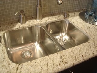
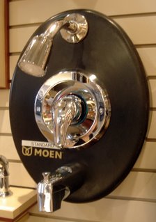
the sink picture is to show how it will be mounted with the granite counter top. of course the granite will be a different colour. the tub and faucet fixtures are your standard garden variety, nothing special there. we figured it would be best to spend money elsewhere and we can always repace a faucet or showerhead later on.

a wonderful floor


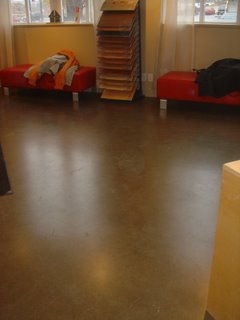
the standard flooring in the loft is amazing in my opinion. it is a polished cement that you can have coloured in a variety of shades. marlito and i stuck with the basic grey but we both agree that it looks great.
as Borat would say, "Wow wow weewa! It's a very nice!"

i'm a big fan of this.... fan


and this is the ceiling fan we will have in the bedroom. there was a different fan that they tried to offer us but it was much too huge and ugly. we prefer things sleek and modern.

Sunday, November 05, 2006

ooops... one more

last of the collection


more shirts


t-shirts


so not too long ago i discovered a little website called threadless. it is a simple site that sells not so simple shirts. i have fallen in love with it and since then started a collection of their merchandise. what follows is a current count of the shirts marlito and i have. i'll just post the graphics now and when we have actual pictures of us wearing them i'll add those later.

ha ha ha

watch this and try not to laugh.